목표
1. sklearn API에서 제공하는 꽃 데이터를 받아서 데이터 분포를 정규화한다.
2. sklearn API에서 제공하는 퍼셉트론 모델을 이용하여 꽃 분류 모델 훈련하고 테스트한다.
3. matplotlib를 이용해 입출력 데이터에 대한 꽃 분류 모델의 Decision boudry를 시각화한다.
1. sklearn API에서 제공하는 꽃 데이터를 받아서 데이터 분포를 정규화 한다.
iris데이터는 아래 3가지 사진에서 보이는 꽃에 대해서 특성데이터(X), 라벨데이터(y)가 주어져 있는 데이터이다.

from sklearn import datasets
import numpy as np

iris = datasets.load_iris()
X = iris.data[:,[2,3]]
y = iris.target
print('클래스 레이블 : ', np.unique(y))
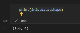
여기서 iris.data는 꽃의 샘플 데이터이다. iris.data의 구조는 아래와 같다.
보통 머신 러닝 프로젝트를 한다면 데이터를 분석하는게 제일 중요한 것 같다. (데이터를 분석한다는 것은 데이터의 차원, 분포도, 평균, 표준편차 등을 예시로 들 수 있다.)
iris.data[:,[2,3]]위와 같이 구성한 명령어는 꽃 분류 데이터의 2번째와 3번째 특성 데이터만 쓰겠다는 뜻이다. (추 후 Decision boundry로 그리기 위함 + 꽃을 분류하기에 충분히 의미 있는 데이터임)
from sklearn.model_selection import train_test_split

#X : 특성 데이터, y : 레이블 데이터, test_size : 데이터에서 테스트에 쓸 데이터 비율, random_state : random seed 값, stratify : 레이블 데이터의 비율 고정
X_train, X_test, y_train, y_test = train_test_split(X, y, test_size=0.3, random_state=1, stratify=y)
다음은 퍼셉트론 모델을 학습 하기 위한 데이터 분할이다.
테스트 셋은 0.3, 학습 데이터 셋은 0.7 비율이다.
그리고 stratify=y 파라미터 의미는 학습용, 테스트용 데이터 셋에 대해서 레이블 값을 균등하게 가지도록 하겠다는 뜻이다.
아래는 stratify=y 파라미터가 있는 것과 없는 것의 차이이다.

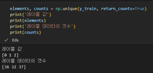
위와 같이 학습용 데이터에 대해서 균등하게 나눠지는 것을 볼 수 있다.
from sklearn.preprocessing import StandardScaler
sc = StandardScaler()
sc.fit(X_train)
X_train_std = sc.transform(X_train)
X_test_std = sc.transform(X_test)
마지막으로 위의 코드는 학습용 특성 데이터 (X) 에 대해서 데이터를 정규화하는 코드이다.
간단하게 StandardScaler Class가 학습용 데이터 X_train을 받아서 데이터의 평균과 분포를 계산하고 이에 맞게 학습용 특성 데이터, 테스트용 특성 데이터를 정규화하는 코드이다.
2. sklearn API에서 제공하는 퍼셉트론 모델을 이용하여 꽃 분류 모델 훈련하고 테스트한다.
from sklearn.linear_model import Perceptron

#eta0 : 학습률, random_state : random seed
ppn = Perceptron(eta0=0.1, random_state=1)
ppn.fit(X_train_std, y_train)
위의 코드는 Perceptron Class를 생성하고 정규화했던 학습용 데이터 셋에 대해서 학습시키는 코드이다.
fit 함수가 입력한 데이터에 대해서 학습하는 코드이다.
y_pred = ppn.predict(X_test_std)
print(f'분류 실패 개수 {(y_test != y_pred).sum()}')
print(f'분류 정확도 {ppn.score(X_test_std, y_test)}')
위의 코드는 학습한 퍼셉트론 모델을 테스트하는 코드이다. Pytorch나 Tensorflow 였으면 모델 정확도 측정에 대해서 코드량이 좀더 많았겠지만 sclearn은 이런 부분을 모두 구현되어 있어서 편하다.

3. matplotlib를 이용해 입출력 데이터에 대한 꽃 분류 모델의 Decision boudry를 시각화한다.
from matplotlib.colors import ListedColormap
import matplotlib.pylab as plt

def plot_decision_regions(X, y, classifier, test_idx=None, resolution=0.02):
    markers = ('s', 'x','o','^','v')
    colors = ('red', 'blue', 'lightgreen', 'gray', 'cyan')
    cmap = ListedColormap(colors=colors[:len(np.unique(y))])

    x1_min, x1_max = X[:,0].min() -1, X[:,0].max() + 1
    x2_min, x2_max = X[:,1].min() -1, X[:,1].max() + 1
    xx1, xx2 = np.meshgrid(np.arange(x1_min, x1_max, resolution), np.arange(x2_min, x2_max, resolution))
    Z = classifier.predict(np.array([xx1.ravel(), xx2.ravel()]).T)
    Z = Z.reshape(xx1.shape)

    plt.contourf(xx1, xx2, Z, alpha=0.3, cmap=cmap)
    plt.xlim(xx1.min(), xx1.max())
    plt.ylim(xx2.min(), xx2.max())

    for idx, cl in enumerate(np.unique(y)):
        plt.scatter(x=X[y == cl,0], y=X[y == cl,1],
                    alpha =0.8, c=colors[idx], marker=markers[idx], label=cl, edgecolors='black')

    if test_idx:
        X_test, y_test = X[test_idx, :], y[test_idx]

        plt.scatter(X_test[:,0], X_test[:,1],
        facecolors='none', alpha =1.0, linewidths=1, marker='o', s=100,label='test set', edgecolors='black')

X_combined_std = np.vstack((X_train_std, X_test_std))
y_combined = np.hstack((y_train, y_test))
plot_decision_regions(X = X_combined_std, y=y_combined, classifier=ppn, test_idx=range(105,150))
plt.xlabel('petal length [standardized]')
plt.ylabel('petal width [standardized]')
plt.legend(loc='upper left')
plt.tight_layout()
plt.show()
위의 에서 정의한 함수는 특성 데이터(x), 라벨 데이터(y), 모델 분류기(퍼셉트론 모델 등..) 을 받아서 Decision boundry를 그려주는 함수이다. 개인적으로 훈련한 모델이 특성 데이터(X)를 어떻게 보고 있는지 확인할 수 있는 그래프를 보는 것은 정말 재밌다.
    x1_min, x1_max = X[:,0].min() -1, X[:,0].max() + 1
    x2_min, x2_max = X[:,1].min() -1, X[:,1].max() + 1
    xx1, xx2 = np.meshgrid(np.arange(x1_min, x1_max, resolution), np.arange(x2_min, x2_max, resolution))
    Z = classifier.predict(np.array([xx1.ravel(), xx2.ravel()]).T)
    Z = Z.reshape(xx1.shape)

    plt.contourf(xx1, xx2, Z, alpha=0.3, cmap=cmap)
    plt.xlim(xx1.min(), xx1.max())
    plt.ylim(xx2.min(), xx2.max())
위의 코드 순서
1. 특성 데이터(X)의 첫번째 특성과 두번째 특성 데이터를 그래프의 X축, Y축으로 구분한다.
2. np.arange()함수를 이용해 특성 데이터 X에 대해서 X축, Y축을 resolution 만큼의 데이터를 나눈 후 xx1, xx2에 저장한다.
(ex : X축 범위 (1~100) 일때 resolution이 1이라면 100개의 데이터가 생성된다. 이때 생성된 데이터는 1씩 증가한 데이터이다. X = [1,2,3,4,5,6])
3. 이렇게 만든 모든 데이터(xx1, xx2)에 대해서 모든 값을 분류기에 입력하고 출력값 Z를 확인한다.
4. Z 값의 차원을 특성 데이터(xx1)의 차원과 동일하게 만든다.(그리기 위함)
5. 위의 과정을 거쳐서 얻은 xx1, xx2에 값에 대해서 contourf 함수를 통해 그래프를 그린다.

for idx, cl in enumerate(np.unique(y)):
        plt.scatter(x=X[y == cl,0], y=X[y == cl,1],
                    alpha =0.8, c=colors[idx], marker=markers[idx], label=cl, edgecolors='black')

    if test_idx:
        X_test, y_test = X[test_idx, :], y[test_idx]

        plt.scatter(X_test[:,0], X_test[:,1],
        facecolors='none', alpha =1.0, linewidths=1, marker='o', s=100,label='test set', edgecolors='black')
위의 코드는 이전 단계에서 그렸던 그래프에서 학습용 데이터와 테스트용 데이터를 입력했을 때 얻은 값을 그래프에 표시하는 것이다.

X_combined_std = np.vstack((X_train_std, X_test_std))
y_combined = np.hstack((y_train, y_test))
plot_decision_regions(X = X_combined_std, y=y_combined, classifier=ppn, test_idx=range(105,150))
plt.xlabel('petal length [standardized]')
plt.ylabel('petal width [standardized]')
plt.legend(loc='upper left')
plt.tight_layout()
plt.show()
마지막으로 위의 코드는 그래프를 보여주기 위해 데이터를 구성하고 Decision boundry 함수에 입력해서 그래프를 확인하는 코드이다.
X_combined_std = np.vstack((X_train_std, X_test_std))
y_combined = np.hstack((y_train, y_test))
위의 두 코드에서 vstack은 vertical stack, hstack은 horizental stack을 뜻한다. 이는 모델의 입출력에 대해서 데이터를 추가하는 것이다.
여기서 X 데이터에 대해서 vstack인 이유는 N * M 행렬이기 때문이다. (N : 데이터의 갯수, M : N번째 벡터에 포함되어 있는 특성 데이터의 갯수)
여기서 y 데이터에 대해서 hstack인 이유는 N 벡터이기 때문이다. (N : 데이터의 갯수)
끝..
'M.S > Machine learning' 카테고리의 다른 글
| OpenCV 4.2, Harr cascade 기반 원하는 객체 검출 과정 (0) | 2023.08.22 |
|---|---|
| sklearn을 이용한 꽃 분류 모델 만들고 시각화 하기(SVM RBF kernel) (0) | 2023.07.12 |
| sklearn을 이용한 꽃 분류 모델 만들고 시각화 하기(SVM) (0) | 2023.07.10 |
| Q-Learning 기반 스케줄링 (0) | 2021.05.18 |
| (DNN) 8명 중 1등, 2등 고르기 (0) | 2021.03.22 |